On your SaaS website, the pricing page is obviously one of the top pages people look at, and it's really comparable to your homepage in terms of importance.
So how can you create a page that is effective and works for your specific product and audience?
Looking at a lot of landing pages as inspiration doesn’t always help.
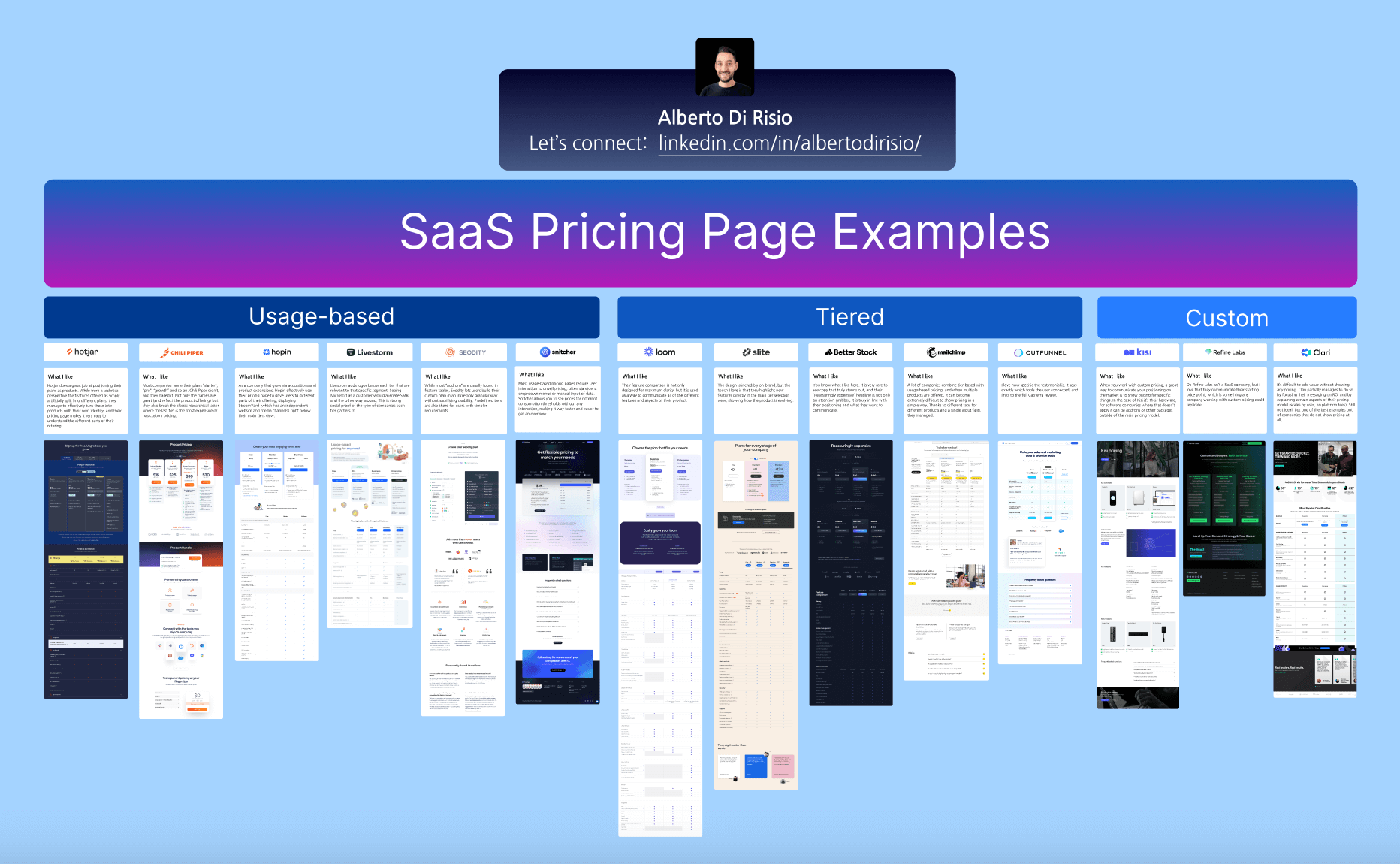
So, I tried something different here. I picked 14 landing pages and for each one, I found one thing they do really well. This way, you can see a good idea and think about how to use it on your own page.
These pages are grouped into three types:
1️⃣ Usage-based pricing (6 examples)
2️⃣ Tiered pricing (5 examples)
3️⃣ Custom pricing (3 examples)
This list includes both companies you definitely have heard of (like HotJar, Loom and Mailchimp) as well as others you definitely aren't familiar with.
Ready to take a look?

Access the Figma file
Here's a sneak peek of the insights you'll find in the file.
Snitcher
Most usage-based pricing pages require user interaction to unveil pricing, often via sliders, drop-down menus or manual input of data. Snitcher allows you to see prices for different consumption thresholds without any interaction, making it way faster and easier to get an overview.
BETTER STACK
You know what I like here. It is very rare to see copy that truly stands out, and their “Reassuringly expensive” headline is not only an attention-grabber, it is truly in line with their positioning and what they want to communicate.
Loom
Their feature comparison is not only designed for maximum clarity, but it is used as a way to communicate all of the different features and aspects of their product.
(Note: The same "Feature Comparison" section is repeated multiple times, so I've only included it once for brevity.)
Refine Labs
Ok Refine Labs isn’t a SaaS company, but I love that they communicate their starting price point, which is something any company working with custom pricing could replicate.
Clari
It’s difficult to add value without showing any pricing. Clari partially manages to do so by focusing their messaging on ROI and by explaining certain aspects of their pricing model (scales by user, no platform fees). Still not ideal, but one of the best examples out of companies that do not show pricing at all.
Hotjar
Hotjar does a great job at positioning their plans as products. While from a technical perspective the features offered as simply artificially split into different plans, they manage to effectively turn those into products with their own identity, and their pricing page makes it very easy to understand the different parts of their offering.
Chili Piper
Most companies name their plans “starter”, “pro“, “growth” and so on. Chili Piper didn’t, and they nailed it. Not only the names are great (and reflect the product offering) but they also break the classic hierarchical latter where the last tier is the most expensive or has custom pricing.
Hopin
As a company that grew via acquisitions and product expansions, Hopin effectively uses their pricing page to drive users to different parts of their offering, displaying StreamYard (which has an independent website and media channels) right below their main tiers view.
Livestrom
Livestrom adds logos below each tier that are relevant to that specific segment. Seeing Microsoft as a customer would alienate SMB, and the other way around. This is strong social proof of the type of companies each tier gathers to.
Seodity
While most “add-ons” are usually found in feature tables, Seodity lets users build their custom plan in an incredibly granular way without sacrificing usability. Predefined tiers are also there for users with simpler requirements.
Mailchimp
A lot of companies combine tier-based with usage-based pricing, and when multiple products are offered, it can become extremely difficult to show pricing in a simple way. Thanks to different tabs for different products and a single input field, they managed.
Kisi
When you work with custom pricing, a great way to communicate your positioning on the market is to show pricing for specific things. In the case of Kisi it’s their hardware, for software companies where that doesn’t apply it can be add-ons or other packages outside of the main pricing model.
Slite
The design is incredibly on-brand, but the touch I love is that they highlight new features directly in the main tier selection view, showing how the product is evolving.